Nio Icon Library
I had the chance to work for the self driving car company Nio on a short term, project based contract. The company were having issues with inconsistent icons throughout their designs. I came in with the aim to create a consistent icon library for all designers to use. I ended up creating an icon library consisting of 128 stroked icons and 128 glyph icons.
Project Type: Icon Design
Role: Icon Design / System Design
Tools: Sketch / Illustrator

Overview
The NIO icon set provides boldness along with a touch of elegance. I created both a stroked icon set along with a glyph icon set. Nio design cars and these icons will be used on car dashboards. The icons need to be easy to see and understand at a quick glance. The glyph icons create contrast and stand out in designs to compete with environmental factors such as sun glare. The stroked icons give a lighter feel to designs, when contrast isn't as crucial.

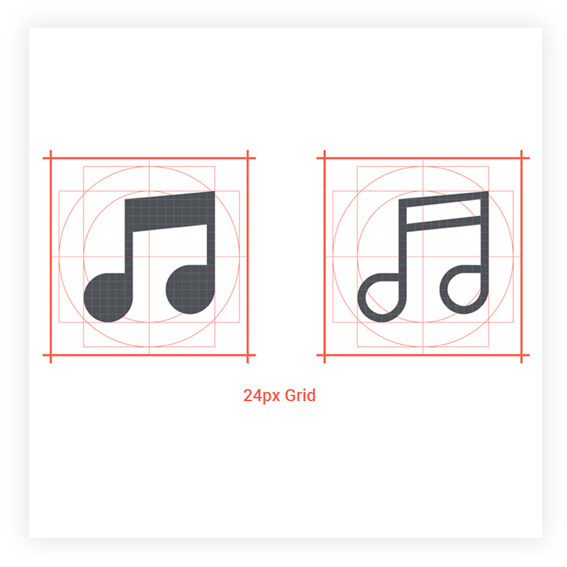
Geometry
Icons are constructed on a 24px X 24px artboard. The guidelines and grid provide basic outlines for shapes.
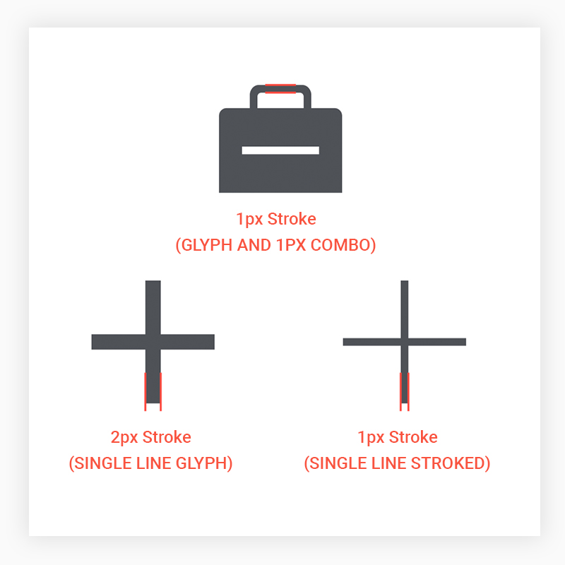
Line Weight
Stroked icons are created with a 1px stroke width and glyph icons are filled in. Some glyph icons are created only from singular lines and require a 2px stroke width to add weight. Glyph icons can use 1px strokes when combined with a filled shape.
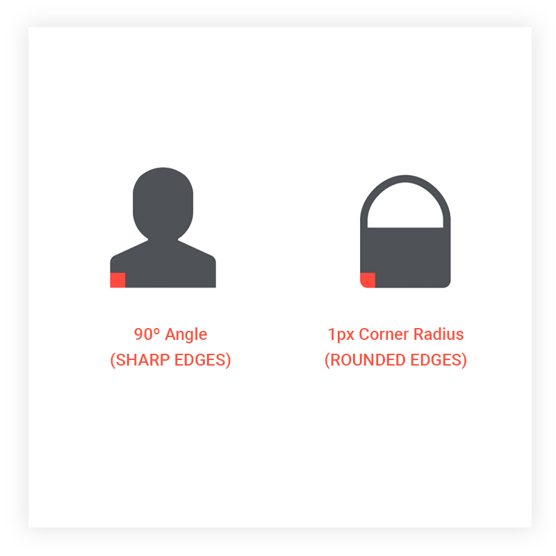
Corners
Icons are created with a mixture of rounded edges and sharp edges. Sometimes the round edges give designs a lighter feel. When rounded edges are required a 1px corner radius is used.
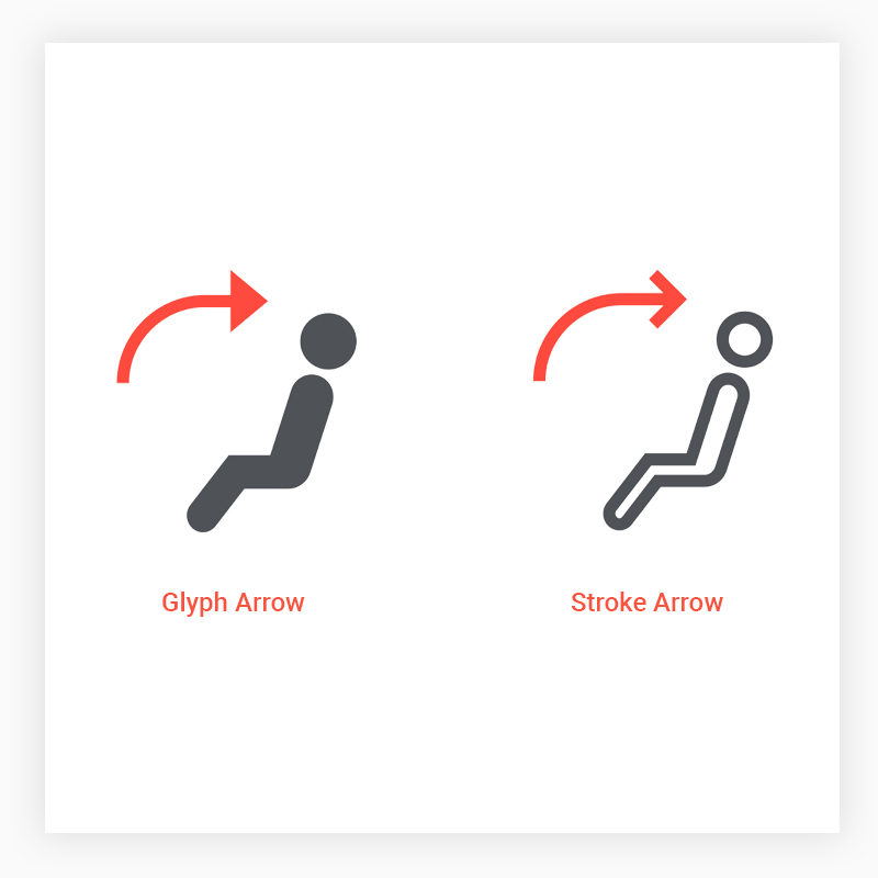
Arrows
Specific arrow styles are used for both glyph and stroked icons. Please see examples of both styles.
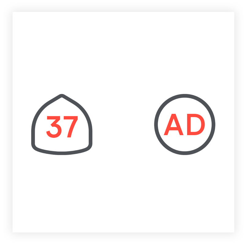
Fonts
Sometimes typography is used within an icon. Use Modern Era font, Bold.
Sketch Libraries
I put all of the icons together in a sketch file and created a Sketch library for all designers to pull from.